

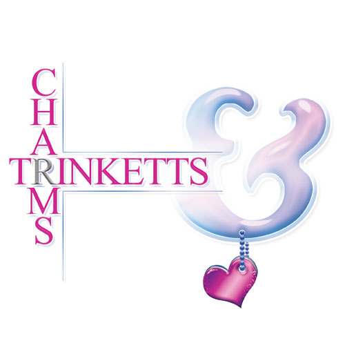

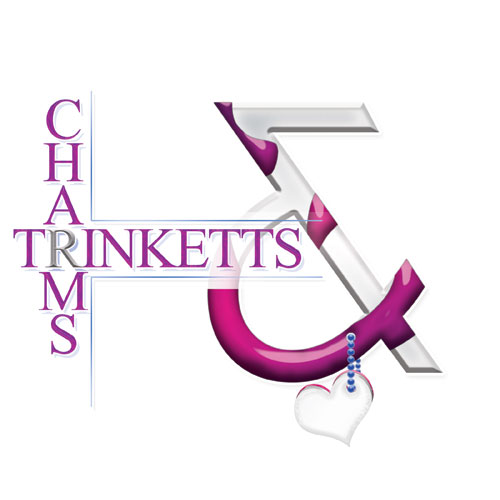

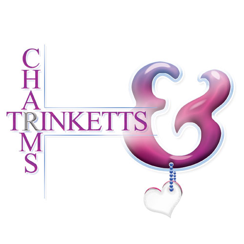
Charms Trinketts needed a logo that reads clearly at small sizes, works on packaging, and still feels boutique. This variation for Charms Trinketts focuses on layout balance and legibility so the brand stays consistent across different placements. For a logo system with multiple usable versions, start with our logo design process.
Core Layout Structure
Each concept follows a similar framework:
Vertical typography: The word “CHARMS” stacked vertically on the left.
Main name: “TRINKETTS” in a thin, elegant serif style.
Primary symbol: A stylized, curving monogram form… resembling a decorative “C” or ornamental flourish.
Accent detail: A small dangling heart charm at the bottom of the symbol… reinforcing the jewelry theme.
Symbol Style
The central icon is flowing and feminine… built from curved strokes.
Some versions include layered bevel effects or drop shadows.
Others introduce chrome-like highlights or soft glow effects.
One variation integrates a more dimensional, metallic treatment.
Color Direction
Dominant palette: pink / magenta gradients with white or silver highlights.
Metallic silver and chrome tones appear in select versions.
Soft romantic aesthetic… boutique jewelry positioning.
![]()
Being in the medicinal industry, Comprar Generico needed a straightforward identity that feels trustworthy and easy to recognize at a glance. The choice of colors, blue & gold, represent trust and happiness. For a clean logo that supports marketing and conversion, see logo design in Pembroke Pines.
This is a clean, modern wordmark logo for “Comprar Generico.”
Structure
Primary icon: A stylized “CG” monogram.
The “C” is rendered in a soft blue gradient.
The “G” is rendered in a warm gold/yellow gradient.
Rounded, thick strokes give the letters a smooth, contemporary feel.
Small “TM” mark appears near the monogram.
Wordmark below:
“COMPRAR” in blue.
“GENERICO” in gold.
All caps, clean sans-serif typography.
Balanced spacing with strong legibility.
Visual Style
Minimalistic and flat with subtle gradient depth.
No heavy outlines, shadows, or decorative elements.
Clear color contrast between cool (blue) and warm (gold) tones.
Overall Impression
Modern, professional, and accessible.
Feels suited for e-commerce or pharmaceutical/retail positioning.
Prioritizes clarity and scalability over ornamentation.
Easily adaptable for digital-first branding.


