
Case study 05 / Author platform + publishing ecosystem
From DIY Frustration to an Author Platform That Finally Felt Right.
Rolanda Desir Andre had already tried to shape Grace et Victoire through Squarespace. The tools were available, but the website still did not look or work the way she imagined. Tight Designs turned the scattered books, mission, media, events, social channels, and future reflections into one polished author platform...and established the approved homepage direction within one day.
 Author website + connected publishing system
A website builder gave her blocks. She still needed a designer to turn the message into a system.
Grace et Victoire is a faith-centered literary and media platform created by author Rolanda Desir Andre. Its work begins with The 12 P's: Towards a Spiritual Transformation, then extends into devotional reflections, podcast conversations, event appearances, speaking opportunities, reader connection, and editions for audiences in several languages.
Rolanda had tried the DIY route with Squarespace. That experience exposed the gap between being able to edit a page and being able to direct an entire brand. Website-builder commercials make publishing look immediate: choose a template, move a few blocks, and launch. The software can make those actions possible. It cannot decide which message deserves the hero, how a reader should find the correct edition, what belongs on a book page versus an author page, how to connect a blog, or how the experience should feel.
Tight Designs reorganized the project around real visitor decisions. The primary website now gives the mission, book, author, podcast and media, speaking events, and contact needs their own clear destinations. A separate WordPress blog provides the reusable publishing environment. Together they form an author platform that can introduce the message, sell books through trusted retail paths, document public work, support interviews and speaking requests, and continue publishing without forcing every function into one template.
Brand direction
Translate faith, transformation, authorship, and professional credibility into a navy, gold, and warm-ivory visual language.
Content architecture
Separate the mission, book, author, podcast, media, events, contact, and ongoing reflections into understandable paths.
Publishing system
Connect a focused static marketing site with a custom WordPress blog that supports featured images, categories, archives, and reusable posts.
Launch transition
Keep Squarespace active during review, move the domain only after approval, connect Hostinger, and preserve the client's control of the domain.
“Easy to build” is not the same as easy to make clear, distinctive, and complete.
The original problem was not a lack of content. Grace et Victoire already had a meaningful story, multiple book editions, personal photography, public appearances, podcast material, and a growing message. The problem was turning those ingredients into one coherent experience.
“I can put things on the page...but it still does not look like what I have in mind.”
That is the hidden cost of many DIY projects. The owner spends time learning a tool, second-guessing layout decisions, correcting mobile problems, and rearranging content without a stable strategy. The platform is functioning, yet the website keeps feeling unfinished.
Visual inconsistency
The previous presentation did not create a dependable hierarchy or a polished author identity across sections.
Unclear navigation
Books, author background, podcast content, events, speaking, contact, and future writing competed for attention instead of supporting one journey.
Several editions and formats
English, French, and Spanish readers needed clear choices among hardcover, paperback, and digital formats without mixing languages or linking to the wrong listing.
Stable pages plus ongoing publishing
The brand website needed speed and focus, while reflections needed an editorial system the client could use after launch.
Squarespace was not incapable of displaying the content. It simply could not replace creative direction, content judgment, brand hierarchy, responsive design, link verification, or a launch plan. A website builder reduces some technical steps. It does not remove the work that makes the website feel intentional.
Give every audience a clear doorway...then reconnect everything around the author and the message.
The structure had to serve readers, book buyers, podcast viewers, event hosts, churches, media contacts, and returning community members without turning the homepage into a directory of disconnected promotions.
Homepage
Mission, transformation promise, The 12 P's, podcast, reflections, author credibility, speaking, and social connection in one guided narrative.
The Book
The twelve principles, the reading promise, three languages, format choices, and eight active Amazon purchase paths.
About Rolanda
Healthcare background, lived faith, care for the whole person, author purpose, and the message behind the mission.
Podcast + Media
Channel feed, selected episodes, interviews, Kreyòl conversation, media topics, and a direct path to invite Rolanda.
Speaking + Events
Seven gatherings organized with dates, locations, selected photography, captions, and an invitation for future events.
Contact + Blog
A protected inquiry flow for reader, speaking, media, and community messages plus a branded WordPress reflections system.
| Visitor | Primary need | Destination | Next action |
|---|---|---|---|
| New reader | Understand the message and whether the book is relevant | Homepage + Book | Choose a language and format |
| Existing reader | Continue applying the principles | Blog + Podcast | Read, watch, and follow the platform |
| Event organizer | Evaluate the speaker and the public message | Events + About | Send a speaking inquiry with date and location |
| Media host | Review conversation topics and prior appearances | Podcast + Media | Request an interview or collaboration |
| Community member | Share a question or message | Contact | Select the reason and send a protected form |
The direction became clear within one day.
Rolanda approved the redesign on August 10, 2026. By August 11, Tight Designs had established the homepage direction that organized the mission, book, author, media, reflections, and speaking paths. Her response was direct: the work looked “awesome and very professional.”
Speed did not mean skipping discovery. It came from identifying the actual problem. The project did not need another template experiment. It needed a defined visual language, a prioritized message, a page hierarchy, and someone willing to make the decisions that a builder leaves to the owner. The remaining work then became a disciplined expansion of an approved system.
Deep navy, warm gold, quiet ivory, and a confident editorial rhythm.
The design balances spiritual warmth with professional credibility. Serif typography gives the book and author material an editorial character, while the supporting sans-serif system keeps navigation, formats, events, and contact choices easy to scan.

A personal platform should connect the author, the book, and the public work.
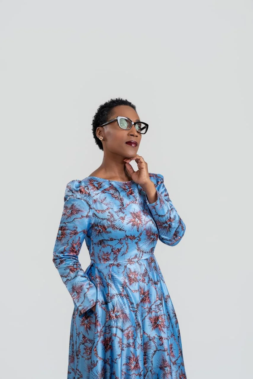
Rolanda's own photography, book artwork, event record, and voice create the visual proof. The website supports that identity instead of replacing it with generic imagery.
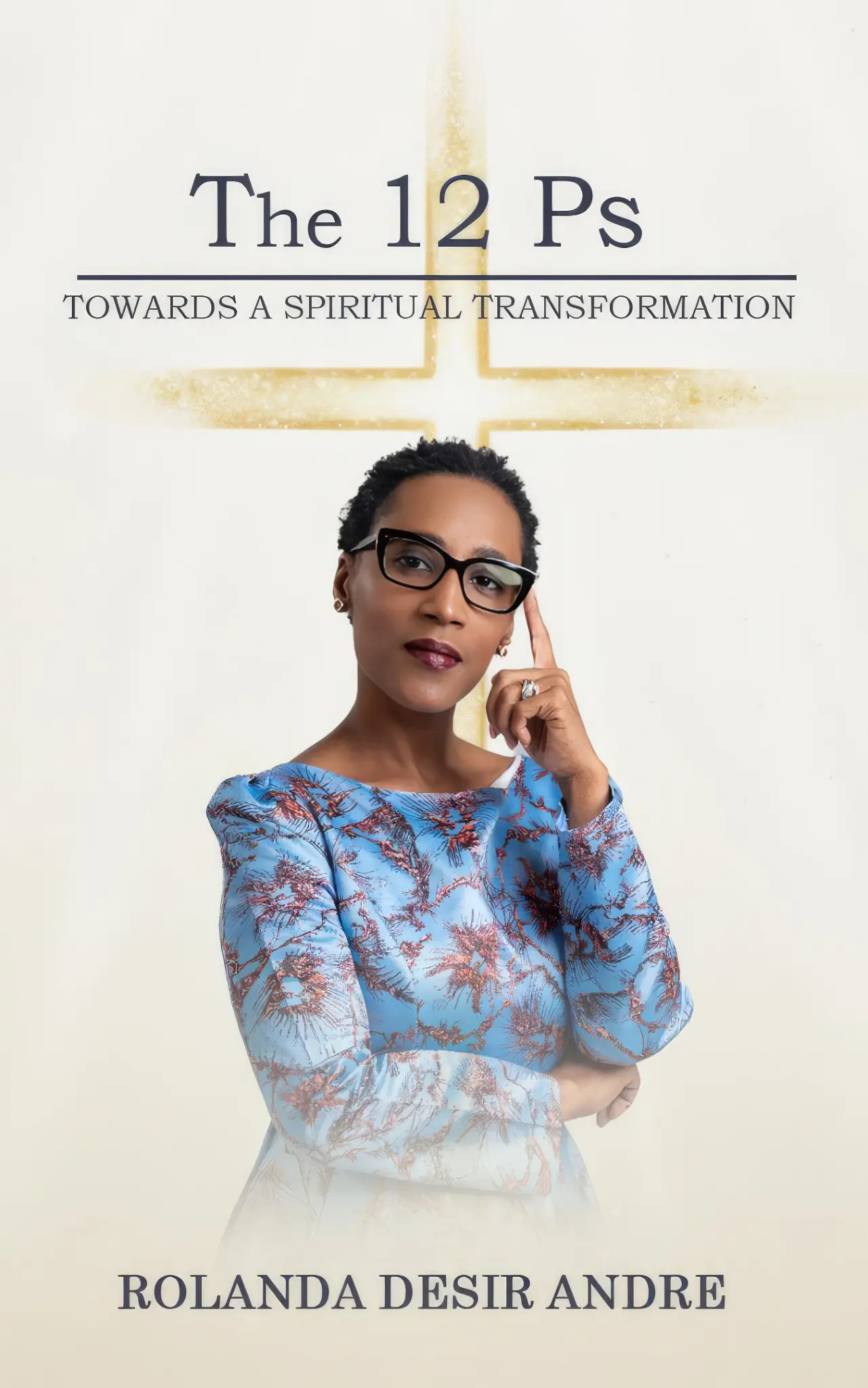
The case study uses approved project photography and brand artwork from the Grace et Victoire website. Personal imagery was selected intentionally because trust in an author and speaker is built through the real person, work, and public record.
Move the visitor from “Who is this?” to the next meaningful step.
The website does not force every visitor toward the same button. It helps people understand the message first, then presents the action that matches their relationship with the platform.
“I found the author, but I cannot tell where to begin.”
The homepage introduces the spiritual transformation promise before presenting books, videos, events, or forms.
Recognize that readers arrive in different seasons and languages.
The content uses an encouraging tone and lets visitors choose a book language, media format, reflection, or conversation without pressure.
Present The 12 P's as a practical companion, not merely an item for sale.
The book page explains the framework and gives each edition a clear, verified purchase path.
Turn a one-time visit into an ongoing relationship.
Podcast episodes, blog reflections, events, and social channels extend the message beyond the initial book decision.
A reader, host, or community member knows exactly what to do next.
Buy the appropriate edition, read a reflection, watch a conversation, explore prior events, or send the right kind of inquiry.
A publishing platform is not a one-product landing page. It should support discovery, trust, purchase, continued learning, public appearances, and direct contact without treating each visitor as if they arrived for the same reason.
Use static pages for the stable brand...and WordPress where ongoing publishing actually helps.
The architecture avoids forcing every requirement into one tool. The primary website remains lightweight and direct. The blog supplies the editorial features needed for reflections, archives, categories, featured images, and future multilingual publishing.
Responsive static website
Six focused HTML pages share one stylesheet and script. Relative asset paths, optimized WebP photography, mobile navigation, accessible keyboard behavior, and reveal fallbacks keep deployment straightforward.
Custom WordPress theme
The separate theme includes a featured latest reflection, three-column archive grid, single-post template, reading time, author box, tags, comments, previous and next navigation, search, categories, pages, and a branded 404.
Protected contact form
The PHP processor validates names, emails, reasons, and message length. A honeypot, minimum completion time, maximum session window, rate limit, cleaned input, safe reply header, and status redirects reduce abuse.
Controlled domain transition
The replacement was reviewed before the Squarespace connection was removed. The domain was then pointed to Hostinger, while the reflections subdomain was connected to its WordPress installation.
The client receives an editorial workflow...not another blank builder.
- Custom blog header, footer, navigation, homepage, archive, search, page, post, comment, and error templates
- WordPress featured-image support, responsive embeds, wide alignment, automatic feeds, and editor styles
- Gutenberg colors and typography aligned with the public Grace et Victoire design
- Elementor support for pages and posts, including full-width and canvas templates when needed
- Author avatar connected to the approved Rolanda portrait rather than a generic account image
- Recommended categories for English, Español, Français, and Kreyòl reflections
- Main-site URL setting that keeps the blog connected even if the public website location changes
- A client guidance video showing how to publish articles through the WordPress blog
The details that seemed scattered became evidence of a complete author platform.
The redesign did not manufacture a story for Rolanda. It organized the work she had already created and made each part easier to understand, verify, and act on.
Book experience
- Twelve principles explained as one transformation framework
- English, French, and Spanish language groups
- Hardcover, paperback, and digital choices
- Eight active Amazon purchase links verified by edition
Author credibility
- Personal faith journey and healthcare background
- Approved portraits and book artwork
- Clear purpose behind Grace et Victoire
- Speaking topics and collaboration invitations
Media continuity
- YouTube channel and recent-video feed
- Selected podcast episodes with descriptive context
- Featured interviews and appearances
- Kreyòl content represented as part of the real audience
Public record
- Seven documented events organized by location and date
- Selected event photography with meaningful captions
- Lightbox viewing with keyboard-friendly controls
- Event invitation connected to the appropriate inquiry path
The clearest result arrived before launch: the client immediately recognized herself in the direction.
A design project succeeds first when the client can say, “Yes, that is what I was trying to create.” Commercial reporting matters later, but it should not be invented to make the launch story sound stronger.
That response came on August 11, within one day of the redesign approval. It verified that the visual and content direction solved the immediate problem the DIY Squarespace attempt had not solved. Later revision cycles expanded the approved system across books, author content, events, media, contact, domain delivery, and the blog.
Approval and launch completion are real results. Sales claims require different evidence.
No traffic, book-sale, inquiry, or revenue increase is claimed here. Those outcomes require analytics, retailer reporting, form records, and a defined comparison period. The case study reports what can be verified now: the timeline, client feedback, implemented structure, connected editions, public content, working inquiry system, and publishing tools.
A cheap or DIY website can become expensive when the owner spends weeks wrestling with layout, carries an unfinished public image, sends visitors through unclear paths, or eventually pays to rebuild the work. The value of professional design is not that it makes every decision more decorative. It shortens uncertainty and creates a system the owner can recognize, approve, and use.
What Tight Designs completed.
The work extended beyond the initial visual redesign into publishing, conversion, media, event presentation, technical transition, and client enablement.
- Website audit, messaging hierarchy, and responsive visual direction
- Homepage, Book, About, Podcast & Media, Speaking & Events, and Contact pages
- Three-language edition organization with eight active retailer paths
- Seven-event presentation with approved photography and lightbox behavior
- YouTube feed, selected episodes, interviews, appearances, and media inquiry path
- Protected PHP contact form for books, speaking, media, community, and general messages
- Custom WordPress blog theme with editorial, archive, search, category, and post templates
- Featured-image, author, mobile navigation, accessibility, and editor styling
- Hostinger deployment, domain connection, blog subdomain, and launch support
- Client article-publishing guidance and reusable blog workflow
The builder is only one tool. Direction is the service.
DIY frustration is often a strategy problem.
Changing templates will not solve an unclear hierarchy. The owner needs decisions about audience, message, proof, pages, and next actions before the layout becomes easier.
Fast approval can come from better judgment.
Establishing the homepage direction within one day was possible because the work focused on the real identity and content instead of producing endless decorative variations.
One platform does not have to do everything.
A stable static website and an editable WordPress blog can work together. The best tool is the one that fits the job and the person maintaining it.
Organization creates perceived value.
The books, languages, events, videos, photographs, and personal story already existed. A professional system made that body of work feel as substantial as it really was.
Questions about the Grace et Victoire website redesign
What did Tight Designs build for Grace et Victoire?
Tight Designs created a custom responsive author website with six primary pages, multilingual book-purchase paths, speaking and event galleries, podcast and media presentation, a protected contact form, domain transition support, and a separate custom WordPress blog theme connected at blog.graceetvictoire.org.
Why did Grace et Victoire move away from a DIY Squarespace website?
The client could use the builder, but the result did not look or function the way she wanted. The difficult part was not placing blocks on a page. It was establishing the brand direction, organizing several audiences and content types, correcting links, arranging book editions, presenting events and media, and creating a consistent experience across screen sizes.
How quickly did Tight Designs establish the approved design direction?
The redesign was approved on August 10, 2026. By August 11, the homepage direction had been established, and the client described it as “awesome and very professional.” Additional pages, content, links, events, media, forms, domain work, and the blog followed through a structured revision and launch process.
How are the editions of The 12 P's organized?
The book experience groups English, French, and Spanish editions by language, then presents the available hardcover, paperback, and digital formats within each group. Eight active Amazon purchase paths are connected, while the French digital edition is clearly labeled as coming soon instead of being presented as available.
Why does the project use both a static website and WordPress?
The primary website uses fast, focused static pages for the stable brand, book, author, media, events, and contact experience. WordPress powers the separate reflections blog, where the client needs an editorial login, post archives, categories, featured images, and reusable publishing tools. The two systems share the same visual identity and navigation.
Does this case study claim increased traffic or book sales?
No. The verified outcomes are the approved visual direction, completed page system, connected purchase paths, event and media organization, protected inquiry flow, domain transition, and publishing infrastructure. Traffic, book sales, speaking inquiries, and revenue should only be reported when first-party analytics and transaction data provide a defensible baseline.