Matte and gloss business cards can both work well, but they do not create the same impression or behave the same way in the real world. The better choice depends on your brand, your design, how the card will be handled, and what you need the card to communicate. This is not just a style preference. It is a practical decision that affects readability, durability, and how professional the card feels once someone actually has it in their hand.
What is the difference between matte and gloss business cards?
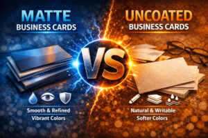
The simplest difference is surface finish. Matte cards have a smoother, flatter, more muted appearance. Gloss cards have a shinier surface that reflects more light and tends to make colors appear more vibrant. That one difference changes a lot about how the card feels and performs.
Matte usually feels more understated and modern. Gloss usually feels brighter and more attention-grabbing. Neither is automatically better. The right choice depends on what kind of business you run and what kind of impression you want to leave behind.
When matte business cards are usually the better choice
Matte business cards are often the stronger option when clarity, sophistication, and readability matter most. They tend to feel more refined and less flashy, which makes them a strong fit for many professional and service-based brands. If your business depends on trust, clean presentation, and a polished look, matte often works very well.
- Great for professional services: attorneys, consultants, medical offices, designers, realtors, and premium service businesses
- Better for readability: less glare can make text easier to read under different lighting conditions
- More understated feel: useful when you want the brand to feel modern, clean, or high-end without looking overly shiny
- Often better for writing: if someone may need to write notes on the card, matte is usually more practical
Matte is often the safer choice when the design relies on typography, spacing, and subtle visual control more than on loud color impact.
When gloss business cards are usually the better choice
Gloss business cards can be a strong choice when you want the design to feel brighter, sharper, and more visually energetic. Gloss tends to make colors pop more, which can be useful for brands with bolder palettes, image-heavy layouts, or a more promotional feel.
- Good for colorful designs: gloss can help saturated colors feel more vivid
- Useful for image-driven layouts: photography, food, beauty, and other visual businesses may benefit from the extra pop
- Can feel more promotional: good when the card is meant to catch attention fast
- Smooth finish: some people associate gloss with a crisp, polished look
That said, gloss is not always the better option just because it looks more dramatic. In some cases, the shine can work against readability or make the card feel less premium depending on the brand.
Readability is one of the biggest deciding factors
If your card includes important contact information, service details, a call to action, or a QR code, readability should carry real weight in the decision. Matte usually has the advantage here because it creates less glare. Under office lights, sunlight, event lighting, or quick real-world handoffs, glare can make gloss cards a little harder to read.
That does not mean gloss is unreadable. It means gloss needs a little more care. If the design already has small text, dense information, or lower-contrast colors, gloss can make those weaknesses more obvious. Matte is often more forgiving when clarity matters.
Brand personality should influence the choice
This is where the decision becomes more strategic. A matte card often fits brands that want to feel clean, dependable, upscale, thoughtful, or modern. A gloss card often fits brands that want to feel energetic, bold, colorful, or more visually promotional.
For example, a luxury home service, med spa, designer, or consultant may benefit more from matte because it feels controlled and polished. A restaurant, party business, beauty brand, or highly visual consumer brand may benefit more from gloss if the brighter finish supports the style of the business.
The finish should match the personality of the brand… not fight it.
How the card will be used matters too
Think beyond appearance. How will the card actually live in the real world? Will it sit in wallets, pockets, purses, trucks, front desks, folders, or event tables? Will people need to write appointment times or notes on it? Will it be handed out quickly in bright outdoor conditions? These practical questions can push the decision one way or the other.
If the card needs to be easy to read and practical in a lot of everyday situations, matte often has the edge. If the card is more presentation-focused and the design benefits from a glossy finish, gloss may make more sense.
Matte vs gloss for service businesses
For many service businesses, matte is often the better choice. That is because service cards usually need to feel professional, readable, and easy to keep. They are often used for estimates, leave-behinds, referral sharing, and day-to-day local networking. In those situations, a clean matte finish often supports the job better than a more reflective surface.
That does not mean gloss never works for service businesses. It can… especially when the brand is more visually driven or the design depends on high color energy. But if the goal is dependable, polished, and easy to use, matte is usually a strong default.
If you want help making that decision based on your actual brand, our business card design services can help.
Matte vs gloss for visual or consumer-facing brands
Gloss can shine more in categories where visual energy is part of the appeal. Restaurants, salons, photographers, entertainment brands, and food businesses may benefit from the extra color pop and slicker presentation. If the card relies on photos, vibrant branding, or a more promotional feel, gloss can help amplify that.
But again… only if the design is built for it. Gloss is not magic. It does not rescue weak design. It only enhances what is already there.
Cost is not always the main issue
In many cases, the decision between matte and gloss is less about cost and more about fit. The bigger question is not which one is cheaper. The bigger question is which one supports the role of the card better. A slightly cheaper finish is not a better value if it weakens the overall impression or makes the card less usable.
If you are deciding more broadly between price tiers and production quality, you may also want to read cheap vs premium business cards.
Neither finish fixes weak messaging
This is important. People sometimes spend too much time debating finish while ignoring bigger issues like weak hierarchy, poor copy, missing calls to action, or cluttered layout. Matte and gloss both matter, but neither one will save a business card that is not built well to begin with.
The finish should support the strategy, not replace it. If the content, structure, and print setup are wrong, the surface finish is not the real problem.
If you are still refining what the card should say, read what to put on a business card and how to write a business card call to action.
So… which one should you choose?
Choose matte if you want a cleaner, more refined, more readable business card that supports a professional or premium feel. Choose gloss if you want more color vibrancy, more visual punch, and a brighter promotional look. The right choice depends on the brand, the design, and the job the card needs to do.
For many local service businesses, matte is often the stronger all-around choice. For highly visual or color-driven brands, gloss can absolutely make sense. The best answer is the one that matches how your business wants to be perceived and how the card will actually be used.
Frequently Asked Questions
Do matte business cards look more premium?
Often, yes. Matte usually feels more understated and refined, which many businesses associate with a more premium look.
Do gloss business cards make colors look better?
They can. Gloss often makes colors feel brighter and more vibrant, especially in bold or image-heavy designs.
Which is easier to read… matte or gloss?
Matte is usually easier to read because it creates less glare under different lighting conditions.
Can I write on matte business cards?
Usually, yes. Matte tends to be more practical when the card may need handwritten notes, times, or reminders.
What is better for service businesses?
For many service businesses, matte is often the better fit because it feels professional, readable, and practical in everyday use.
Need Help?
If you are trying to decide between matte and gloss business cards, Tight Designs can help you choose the finish that fits your brand, your design, and the way your business actually uses cards. You can explore our business card services or contact us to get started.