A B C D E F G H I M O P R S T U V W ←TIPS → WEB DESIGN TERMS
Glossary
Actual Weight: The real, physical weight of the paper you are printing on. This matters most for shipping costs and sometimes for pricing on large orders.
(see also basic size, basis weight, weight)
No Coating: This means your print will have no protective coating applied after printing. It can feel more “natural” and is easier to write on, but it is also more likely to show scuffs, fingerprints, or ink rub on dark solid colors. If you want extra protection or shine, look for options like aqueous coating, UV coating, or varnish.
Tip: If you need to write on it (pens, stamps, signatures), “no coating” is often the safest choice.
(see also coated stock, finishing, UV coating, varnish)
Binding: The method used to hold pages together so they read like a book, booklet, or manual. Common types include staples (saddle stitch), glue (perfect binding), spiral, and hardcover.
For related terms see also finishing, folding, imposition, scoring.
Bleed
Bleed means your background color or image goes past the edge of the final paper size.. Printers trim the sheet down after printing, so bleed helps you avoid unwanted white edges. A common bleed is 0.125″ (1/8″) on each side.
C1S: “Coated 1 Side”… paper that is coated on one side only (useful when you want one glossy side and one writable side).
C2S : “Coated 2 Sides”… paper that is coated on both sides (common for postcards, flyers, brochures).
Calendaring: A finishing step in paper manufacturing where the paper passes through heated metal rollers to make it smoother (and sometimes shinier). Smoother paper usually prints sharper images.
Caliper
The thickness of paper, usually measured in thousandths of an inch (mils). Thicker paper can feel more premium, but it can also affect folding, scoring, and binding. Very inconsistent thickness can cause printing and finishing issues.
Case Binding: A hardcover book style… pages are bound inside rigid “case” covers.
CMYK: The four inks used for full-color printing… Cyan, Magenta, Yellow, and Black. Most professional print is produced in CMYK.
Coated Stock
Paper with a coating that makes the surface smoother. This usually improves photo quality and sharpness and can change the feel (gloss, dull, matte). (see also cast-coating, clay, dot gain, dull coated, four-color process gloss, halftone, ink holdout, matte coated, off-machine coating)
Color Key: A proof that helps you preview CMYK layers separately… often shown as four overlays. It’s mainly used to check how colors separate and build.
Color Separation
The process of breaking full color artwork into print-ready parts (usually CMYK) so each ink can be printed correctly.
Contrast
How strong the difference is between light and dark areas in an image. High contrast looks punchy and dramatic. Low contrast looks softer and flatter.
Conversion: Turning a flat printed sheet into a finished 3D item… like an envelope, pocket folder, carton, or box.
Copy
The content for your print piece… text, photos, logos, and graphics.
Cover Paper : Thicker, stiffer paper often used for business cards, postcards, folders, and booklet covers. The basic size of cover stock is typically 20″ x 26″.
Crop : Cutting away part of an image or design. Crop marks show the printer what will be trimmed off.
Cut-size: Standard office paper sizes (like 8.5″ x 11″, 8.5″ x 14″, 11″ x 17″) cut down from larger sheets and commonly packed in 500-sheet reams.
Die-cutting
Cutting paper into custom shapes using a metal blade (a “die”). This can be used for stickers, labels, folders, packaging, and special shaped cards. It usually increases cost because it requires custom tooling and extra setup.
(The total cost of the job will increase.)
Digital Imaging: Creating print-ready output from a digital file… like a photo, illustration, or design. Output can be film, paper proofs, vinyl, and more.
Digital Printing: Printing directly from a digital file, without printing plates. Great for short runs, quick turnarounds, and variable data (like name changes).
Dot Gain
When printed dots spread slightly and appear bigger than intended. This can make images look darker or less sharp than expected. (see also, four-color process, halftone)
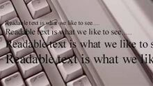
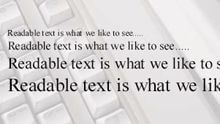
DPI (dot per inch): Image detail/resolution. Higher DPI usually means sharper prints… especially for photos. As a practical rule, aim for 300 DPI at final print size for most high-quality printing.
(see also halftone, lines per inch, screen)
Drop Shadow:
A shadow effect behind text or graphics to create depth. Use lightly… heavy shadows can look muddy in print.
Dull Coated: A coated paper finish between glossy and matte… less shine than gloss, but still smoother than uncoated.
Duotone
A photo effect made from two inks/colors. Often used for a stylized, high-end look.
Embossing:
A raised (or pressed) design created with metal dies and pressure. Great for logos and premium details.
EPS: Encapsulated PostScript… a vector file type. Vector art stays crisp at any size (logos and icons). EPS is common in professional print workflows.
(Bitmap images use pixels and can look blurry if enlarged too much.)
Fifth Color: Printing that uses CMYK plus one extra ink (usually a spot color like metallic or neon). It can raise costs because it may require a press setup with an extra ink unit… plan for it if color accuracy is critical.
Finish: The surface look and feel of paper. Common finishes include gloss, matte, dull, and uncoated.
Finishing: The steps after printing that turn sheets into the final product… trimming, folding, scoring, binding, laminating, coating, etc.
(see also binding, folding, trimming)
Flush Cover: A booklet/book where the cover is trimmed to the exact same size as the inside pages.
Foils : Special metallic-looking films or papers, or metallic foil stamping applied to specific areas. Often used for premium accents.
Folding: Bending paper so one part lies on top of another. Thick paper often needs scoring first to prevent cracking. Fold direction can also matter (grain direction).
(see also binding, finishing, gatefold, imposition, scoring)
Four-color Process: Full-color printing using CMYK dots. Photos and complex artwork are usually printed this way. Your eyes blend the tiny dots into smooth color.
(see also color separation, dots per inch, halftone)
Ganging
: Printing multiple different jobs on the same large sheet to reduce cost (common in online trade printing).
Gatefold : A fold style where both sides fold inward toward the center (like doors closing).
(see also folding)
Gloss: How shiny a paper surface is. Glossy coatings reflect more light and can make colors look more vibrant… but can also show fingerprints more.
Grade : A category of paper type and quality level (writing, cover, tag, index, etc.).
Grain Long: Paper fibers run along the long side of the sheet. This often folds more cleanly when the fold runs parallel to the grain.
Grain Short : Paper fibers run along the short side of the sheet. Folding against the grain can increase cracking… especially on thick stocks.
Gripper
Metal fingers on a press that grab and move the sheet through the printing units.
Gripper Edge
The leading edge held by the grippers. Some print layouts avoid important content near this edge because it can affect ink and trim safety.
Halftone
A technique that turns photos into printable dots. This is how presses reproduce shades of gray and color detail.
Image setter
: A high-resolution device that outputs film for plate making (more traditional workflows). Modern shops may be fully direct-to-plate instead.
Imposition
Arranging pages on a large sheet so they print, fold, and bind in the correct order. This is how a printer turns “Page 1, Page 2, Page 3…” into a booklet that reads properly.
M weight
The weight of 1,000 sheets of paper in a given size. Often used for estimating shipping and handling.
Match Color: A custom mixed ink made to match a specific reference color (like Pantone). This is used when you need a logo color to be very consistent.
(see also PANTONE MATCHING SYSTEM)
Matte Coated: A coated paper with little to no shine. It’s smooth like coated stock but looks softer than gloss… popular for modern designs.
Offset Printing (Offset lithography)
A common printing method used for large runs. Ink transfers from plate to a rubber blanket, then onto paper. Offset is excellent for consistent quality and cost efficiency at higher quantities.
PANTONE MATCHING SYSTEM: A standard color system used to choose and reproduce exact colors. Designers pick a Pantone color swatch, and printers use formulas to mix inks to match it.
PDF: Portable Document Format… the most common “print-safe” file type for sending designs. PDFs can embed fonts and images so your layout stays consistent.
Perfect
Perfect binding uses glue on the spine to hold pages together. Common for books, catalogs, and thicker booklets.
Photo Illustration: Artwork that is mainly made from a photo (or multiple photos combined).
Pixel Depth: How much color information each pixel can hold. Higher bit depth can help with smoother gradients and editing, but final print readiness also depends on correct color mode and resolution.
Plate: A thin metal sheet used in offset printing that carries the image to be printed.
Point
A typography measurement… 72 points equals 1 inch. Example: 12pt is common body text size.
PrePress: The steps before printing begins… checking files, preparing proofs, converting colors, trapping, imposing, and making plates (if needed).
Press Proof: A small test run printed on the actual paper stock to preview results before the full job prints. This is one of the best ways to confirm color and quality.
Printability
How well a paper can reproduce sharp detail and solid color. Smoothness, absorbency, and opacity all play a role.
Print Quality: The overall quality of the final printed piece… affected by file setup, paper choice, ink, press calibration, and finishing.
(see also printability)
Process Colors: CMYK inks used to create full-color images. Photos are usually printed with process colors.
Registration
How precisely different ink colors line up on top of each other. Poor registration can cause blurry edges or colored “halos” around text and graphics.
RGB: Red, Green, Blue… the color system screens use. RGB can look brighter than print. Most print requires CMYK, so RGB artwork usually needs conversion.
Saddle Stitch
Binding with staples through the fold (spine). Common for booklets, menus, and magazines with lower page counts.
Sans Serif : A font style without small “feet” (serifs). Often looks clean and modern.
Scoring
A crease pressed into paper to help it fold cleanly. This is especially important for thick paper so it doesn’t crack.
Screen: A method (often described in lines per inch) used to break images into dots for printing. Higher line screens can show finer detail, especially on coated paper, but print conditions limit how fine it can go.
Screen Printing : A process where ink is pushed through a stencil screen onto the material. Common for apparel, signage, posters, and specialty items.
Script : A font style that looks like handwriting. Use carefully for readability… especially at small sizes.
Scum: Unwanted ink marks in areas that should be clean.
Self Cover
A booklet where the cover is the same paper as the inside pages.
Serif : Fonts with small “feet” or strokes at the ends of letters. Often used for body text in books and longer reading.
Spiral Bind :
A plastic or wire coil threaded through holes along the edge. Common for notebooks, manuals, and calendars.
Spot Color : A single, specific ink color printed as its own layer (often Pantone). Used for brand color accuracy, metallics, neons, and simple 1–3 color jobs.
Stock Paper : The paper (or material) you print on. “Stock” can also mean a standard paper the shop keeps on hand.
Swatchbook: A sample book of paper options showing how different stocks look and feel… useful for choosing the right paper.
TIFF: A high-quality image file format often used for photos in print workflows. TIFFs can be large, but they preserve detail well.
Trapping
Slightly overlapping adjacent colors so tiny misalignment doesn’t create white gaps. This is a behind-the-scenes print safety technique.
Trim Size: The final finished size after the piece is cut. Example: a business card trim size is typically 3.5″ x 2″.
Trimming: Cutting after printing (and sometimes after binding) to make everything clean, even, and the correct size.
Up
How many copies fit on a larger sheet during printing… “2-up,” “4-up,” etc.
UV Coating: A shiny, durable coating cured with UV light. It adds strong protection and gloss, but it can affect write-ability and may slightly shift certain colors.
Varnish: A clear coating printed over ink to protect it and change the look (gloss, satin, matte). It can be applied over the whole sheet or just specific areas (“spot varnish”).
Web Press: A high-volume press that prints on rolls of paper. Common for newspapers, magazines, and long-run work.
Weight : How heavy paper is… often shown as lb (text/cover) or gsm. Paper weight naming can be confusing because different paper categories use different “basis sizes.” If you want a simple comparison, ask for the equivalent in gsm, or ask your printer what thickness feels closest to what you want.
Web Design Terms
Domain: Your website’s name on the internet (example: yourbusiness.com). You rent it and renew it yearly.
Hosting: The service that stores your website files and makes your site available online. Without hosting, the domain has nowhere to “point.”
DNS: The settings that connect your domain to your hosting, email, and other services. Think of it as the routing system for your domain.
SSL Certificate: Security that makes your site load as https (with the lock icon). It protects visitors and helps trust and SEO.
CMS: Content Management System… a tool that lets you update your site without coding. Common examples include WordPress and Shopify.
WordPress: A popular CMS used to build and manage websites. It uses themes and plugins to add features.
Theme: The design “skin” of a site (layout, styles, templates). Changing the theme can change the look drastically.
Plugin: An add-on that adds features (forms, SEO tools, speed tools, ecommerce, etc.). Too many plugins can slow a site down.
Responsive Design: Your site automatically adjusts to look good on phones, tablets, and desktops.
Landing Page: A page made for one goal (get a call, get a form submission, sell one offer). Usually used for ads and campaigns.
Call to Action (CTA): The main “next step” you want a visitor to take… like “Call Now,” “Get a Quote,” or “Book an Appointment.”
SEO: Search Engine Optimization… improving your site so it can show up better on Google (content, page titles, speed, links, and more).
Meta Title / Meta Description: The title and preview text that can show in Google search results. These affect clicks and clarity.
Alt Text: A short description of an image used for accessibility and sometimes SEO. It helps screen readers and can help Google understand images.
Sitemap: A list of your important pages that helps search engines discover and crawl your site (often sitemap.xml).
Robots.txt: A file that can tell search engines what to crawl or not crawl. Misconfigurations can accidentally hide your site from Google.
301 Redirect: A permanent forwarding from one URL to another. Useful when you change page links so you don’t lose traffic or SEO value.
Analytics: Tracking that shows how people find and use your site (visits, pages viewed, conversions). Common tool: Google Analytics.
Pixel: A tracking script (often from Meta/Facebook, Google Ads, etc.) that helps measure ad results and build remarketing audiences.
Page Speed / Caching: Techniques to make your website load faster. Faster sites usually convert better and can rank better.
CDN: Content Delivery Network… speeds up your site by serving images/files from servers closer to the visitor.
Backup: A saved copy of your website so it can be restored if something breaks. Backups should be automatic and frequent.